
CTgoodjobsWeb RevampJun 2022 - Jan 2023
Revamping Career Resources Section for Growth and Engagement
Overview
CTgoodjobs, a leading recruitment platform in Hong Kong, faced significant challenges with an outdated website that hindered usability and engagement, making it difficult to stay competitive in a rapidly evolving market.
To address these issues, we decided to initiate a full website revamp, starting with the career resources section — a key part of CTgoodjobs that drives high traffic and supports a key revenue stream through our employer branding services.
Our goals were to improve content discoverability by rethinking the information architecture, redesign the interface to deliver a seamless experience across devices, and modernise the content strategy to unlock new opportunities for business growth. By providing job seekers accessible, high-value resources, we aimed to empower users on their career journeys while driving long-term business success.
Page views
Daily active users on mobile
New partnerships
🙋🏻♀️My role - Sole designer
- Collaborated with team leaders on strategic planning
- Led the entire design process from research to launch
- Delivered design assets and established the first design system
👯Team members
- Product Manager, Business Analyst
- Development Manager, 4 Developers
- Content Manager, 2 Content Strategists


Challenges
Building a future-proof design
Our career resources section serves two key purposes: (1) providing valuable content for job seekers, and (2) supporting our key revenue stream through employer branding services. As the first phase of a full website revamp, this project came with significant challenges:
🕸️Scope & complexity
We had to revamp the design theme, front-end tech, and back-end system, which required detailed planning and coordination to avoid disrupting ongoing operations.
🌱Future-proof design
We needed to create a flexible, scalable design that could ensure consistency and be easily adapted across the entire site.

CTgoodjobs' web structure
Key Problems
Frustrating experience, inefficient process, and limited growth
To understand the current issues, I conducted product surveys, team discussions, and stakeholder interviews. These methods allowed me to gather insights from users, internal teams, and stakeholders, helping identify the following key problems:
🔎Poor content discoverability
30% of users struggled to find relevant resources on mobile, due to navigation and search problems.
🏷️Inefficient management
Inconsistent and unclear categorisation caused confusion for users and added extra work for the content team.
📉Limited business growth
The outdated content structure limited opportunities to expand employer branding services.
Solutions
Revamping the information architecture and interfaces
To address the above challenges, I focused on 4 key areas that would improve usability and support our business goals:

➊ Content Categorisation
Restructured content categories to improve discoverability and streamline content management.
Jump to Section
➋ Navigation
Designed accessible navigation to handle the complex web structure across platforms.
Jump to Section
➌ Search Experience
Added an intuitive search feature to help job seekers find career resources easily.
Jump to Section
➍ Interface Design
Created modern, user-friendly, and scalable designs to support long-term product growth.
Jump to SectionRevamp Roadmap
➊ Content Categorisation → ➋ Navigation → ➌ Search Experience → ➍ Interface DesignImproving content categorisation for discoverability and management
Overview
The career resources section originally had over 40 categories and subcategories, including career news, corporate interviews, letter templates, and more. However, this extensive structure created 2 key issues:
- Poor discoverability: Ambiguous labels made it hard for job seekers to find the content they needed.
- Inconsistent organisation: The disorganised structure complicated content management for the team.
Problem Analysis
Poor clarity, finability, and learnability
To better understand the issues with content discoverability, I conducted an IA audit. This allowed me to systematically evaluate the existing structure and identify key problems:
- Clarity: Ambiguous category names and overlapping content confused users.
- Findability: Poor organisation made it hard for users to locate content.
- Learnability: Too many subcategories made navigation and understanding difficult.

Original sitemap of the career resources section
Research
Exploring content categorisation trends
I also worked with the content team on a competitive analysis to see how career content is categorised across the industry. Our goal was to:
- Identify standard patterns and terminology.
- Ensure our content aligns with user expectations.
- Improve discoverability for users.

Research on competitors with career-related resources
Solution
Creating clear, organised, and new categories for better discoverability and business growth
Using insights from research and team discussions, we improved content categorisation by:
Relabelling categories
- Replaced complex or ambiguous labels with simple, recognisable terms to ensure clarity and prevent confusion.
| 🌚Before | 🌝After |
|---|---|
| CV & Resume | CV |
| Tools | Useful Info |
| Blog | Columnists |
Reorganising categories
- Restructured content to align with job seekers’ journey.
- Simplified the structure by reducing subcategories, improving findability and understanding.
| 🌚Original | 🌝Restructured |
|---|---|
| Celebrity Corner | Emerged into Features |
| Workplace Gossips, Hot Topics | Organised under a new category Career Gossips |
| Career Planning, Recruitment | Removed and content inside were re-categorised |
Adding new categories
- Collaborated with the content team and stakeholders to identify strategic opportunities for new categories.
- Suggested promotional areas to drive business growth while offering valuable resources to job seekers.
| ⭐New Category | 🌟Details |
|---|---|
| Industry Focus | Feature specific industry news / paid collaborations |
| Collections | Highlight specific career topics / paid collaborations |

Revised sitemap of the career resources section
Testing
Validating new categorisation with card sorting
To ensure the new content structure addressed user needs, I used FigJam to conduct a closed card sorting exercise with our content strategists and job seekers. This allowed us to test how effectively content was organised under the old vs. new categories and whether the changes improved content discoverability and usability.
Following the card sorting, we conducted brief user interviews to gather additional insights and evaluate the following:
- Time spent: How quickly participants could sort content.
- Accuracy: How well the sorting matched expectations.
- Ease of understanding: User ratings of clarity and comprehension.
💡Insights
- Simplifying categories with common wording improves comprehension.
- Using Chinese titles with an English categorisation can cause confusion. The content team should consider clarity when crafting titles.

Closed card sorting on FigJam
Revamp Roadmap
➊ Content Categorisation → ➋ Navigation → ➌ Search Experience → ➍ Interface DesignBuilding effective navigation for a complex web structure
Overview
As the business grew and categories expanded, the web structure became more complex. However, the original navigation menu struggled to support this growth. It lacked scalability to handle the increasing number of categories and was difficult to navigate on mobile devices, creating obstacles for users and hindering content discoverability.

The original mobile navigation design caused content shifts and pushing the primary content down when expanded
Design Principles
Creating a flexible and scalable navigation menu
To create a future-proof navigation menu, I focused on these key elements:
🔄Flexibility & scalability
The menu must accommodate a varying number of items to support business growth and content expansion.
📱Intuitive accessibility
It should be user-friendly and easy to navigate on both desktop and mobile, reducing the learning curve for users.
Desktop Navigation
Encouraging exploration with a sticky sub-navigation
To improve navigation in complex sections like "Resources" while maintaining a familiar desktop experience, I kept the horizontal navigation and added a sticky sub-navigation. It allows users to easily navigate within the section as they scroll, encouraging deeper exploration.

The horizontal navigations on different devices
⚠️Constraints
However, the limited horizontal space on smaller screens restricts the number of menu items we can display. I collaborated with teams and stakeholders to prioritise essential menu items, balancing user needs with business goals without compromising the layout.
Mobile Navigation
Dual side menus for better organisation and accessibility
To improve navigation and accessibility on mobile devices, I implemented dual side menus, a familiar and user-friendly mobile navigation pattern. One menu serves as the main menu, while the other is for account management. Both menus are integrated into the sticky top navigation, ensuring easy and constant access.

Dual side menus on mobile
Flexible and scalable design
To create flexible and scalable side menus, I leveraged these UI elements:
- Scrollable menus: Accomodate additional menu items as the product evolves, ensuring scalability.
- Accordions: Organise menu items into layers for progressive disclosure, preventing users from feeling overwhelmed.

Sliding menus when browsing on mobile devices
Testing
Quick validation through hallway testing
Under time constraints, I conducted hallway testing with colleagues from different teams, who were not involved in this project to reduce bias.
Participants completed navigation tasks using a prototype, and all successfully accomplished them without difficulty.
💡Insights
Using common navigation patterns fostered familiarity and reduced cognitive load, making navigation easier across platforms.
The prototype for hallway testing
Revamp Roadmap
➊ Content Categorisation → ➋ Navigation → ➌ Search Experience → ➍ Interface DesignEnhancing search experience for efficient content access
Overview
After our extensive content recategorisation, the career resources section still contained over 20 categories with thousands of items. However, user feedback and feature evaluation revealed that the original search feature was difficult to access and lacked essential functionalities, making it challenging for users to find the content they needed.

The original resouces landing page with a non-sticky search bar

The original search - "Advanced Search" on mobile
Desktop Search
Improving accessibility with a pop-up search panel
To improve search accessibility, I added a search button to the sticky sub-navigation. This button opens a pop-up search panel, ensuring the search feature is always available, even when scrolling through long pages.

Accessing the search function via the sticky sub-navigation
New search features for efficiency
The pop-up search panel provides ample space for integrating new search features, enhancing efficiency and content discovery:
- Recent search: Allow users to revisit previous searches.
- Popular search: Highlight trending keywords to encourage exploration and drive traffic.

The pop-up search panel
Desktop Search
Refining search results with filters
Previously, our “Advanced Search” feature allowed users to add extra criteria during a keyword search. However, the lack of filters on the results page forced users to start new searches very time they wanted to refine the results, leading to unnecessary page refreshes and frustration.
To improve the experience, I replaced “Advanced Search” with a simplified keyword search that focuses on speed and flexibility. Users now can view results quickly and refine them using intuitive filters directly on the results page, creating a seamless and efficient search experience.

Refining search results with filters
Mobile Search
Improving accessibility with a floating search button and bottom sheets
Due to limited screen space on mobile, I chose not to include the sub-navigation, making the pop-up search panel unavailable. To address this, I included a floating search button that opens a search bottom sheet.
This solution ensures users can access the search function from anywhere on the page, providing a smoother and more convenient mobile search experience.

Floating search button when scrolling down on mobile devices
Bottom sheets for searching & filtering
To align with the desktop search while adapting to mobile screen size constraints, I implemented bottom sheets for searching and filtering. This widely-used mobile UI pattern offers ample space for our new search features while ensuring a familiar and intuitive experience:
- Clear close button: Provide an easily recognisable way to dismiss the bottom sheet.
- Mobile-friendly slider: Accommodate varying numbers of recent or popular searches without overcrowding the screen.
Accessing the search on mobile
Filtering search results on mobile
Empty State
Redesigning the “No results” page to drive engagement
To turn a potentially frustrating experience into a helpful one, I redesigned the “No Results” page with the following improvements:
- Alternative keyword suggestions: Offer alternative keyword suggestions based on the user's initial search to guide them towards relevant results and encouraging further exploration.
- Humanised message: Include a friendly, empathetic message acknowledging the inconvenience while proactively offering assistance and solutions.
- "Latest articles" section: Feature the latest articles from the career resources section, encouraging users to explore relevant articles even when their search yields no results.

The new "No results" page
Testing
Validating the new search experience
Before launching, we invited 6 CTgoodjobs users to test the new search functionality and provide real-time feedback. Participants completed several search tasks and explored the feature freely. We were pleased to see that all users completed their tasks intuitively and easily.
🗣️Feedback
Future Scope
Implementing autocomplete for better search experience
Autocomplete can greatly improve the search experience by offering relevant keyword suggestions as users type.
After discussions with the development team, we discovered that integrating this feature would require additional time to align the keyword database with recent changes in our information architecture.
To ensure a timely launch, we decided to prioritise this enhancement for the next phase.

Mockup - Predictive search with autocomplete
Revamp Roadmap
➊ Content Categorisation → ➋ Navigation → ➌ Search Experience → ➍ Interface DesignCreating usable and future-proof interfaces
Overview
Our outdated 5-year-old design hindered usability and reduced engagement, affecting CTgoodjobs’ competitiveness in a rapidly growing market. This redesign aimed to enhance the browsing experience, improve user engagement, and create a scalable design that could support future growth and adapt seamlessly to upcoming revamp stages across the entire site.

Before & after - Resources landing page
Visual Design
Enhancing readability and engagement for text-heavy content
To enhance the reading experience in the text-heavy career resources section, I focused on improving both typography and layout:
- Typography: I selected Open Sans as the primary font for its friendly appearance and excellent legibility across various languages. It is optimised for both desktop and mobile web to ensure a consistent and comfortable reading experience across platforms.
- Layout and spacing: I prioritised clear layouts with ample spacing between elements to enhance readability, guiding users' attention to the core content. This involved collaborating with the product team and stakeholders to remove unnecessary elements and distractions.

Article detail page - Before & after - Enhanced readability and overall aesthetics
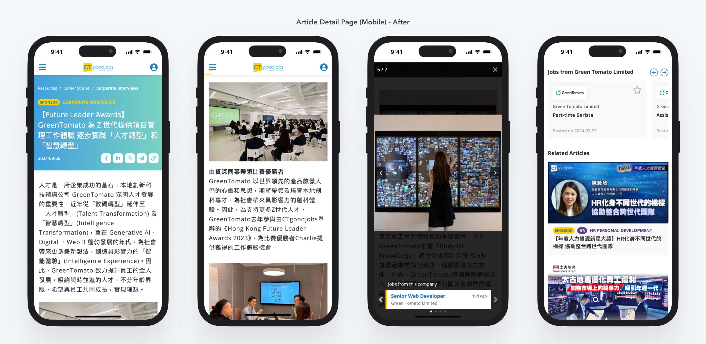
Article detail page on mobile - After - Enhanced readability and overall aesthetics
Future-proof Design
Designing flexible and scalable solutions for future growth
To support the long-term growth of the product, I prioritised flexibility and scalability in my design solutions:
- Flexible design: I collaborated closely with teams and stakeholders to anticipate future changes, creating UI components and layouts that can easily adapt to new features or updates.
- Component-based approach: I built reusable UI elements to promote scalability and maintainability. These components can be applied across various sections of CTgoodjobs, ensuring consistent design and supporting future development.

Flexible design patterns - Mobile-touchable sliders and scrollable area
Usability Design
Enhancing layouts for better usability
To enhance the usability of the career resources section, I focused on optimising layouts, ensuring design consistency, and leveraging familiar patterns.
- Layout optimisation: I restructured the “Useful Info” section to make downloadable resources easier to find and access, significantly enhancing the content discoverability and overall experience.
- Design consistency: I ensured consistent typography, colours, wording, transition effects, and UI elements throughout the career resources section. This reduced cognitive load and created a sense of familiarity with our products.
- Common design patterns: I used common design patterns like side menus and bottom sheets to provide intuitive interactions, minimise the learning curve, and ensure a smooth user experience.

Before & after - Resources "Useful Info" section - Improved accessibility to downloadable content

Sub-sections under "Useful Info" leveraging similar layouts

Utilising common mobile pattern - Bottom sheets
Impact
Improved user engagement, operational efficiency, and business growth
We evaluated the impact of the new career resources section one month after its launch. Our data revealed the following achievements:
Page views
Daily active users on mobile
Bounce rate
User satisfaction
Time on operational process
New partnerships
It significantly expanded our employer branding services, generating over $700K in revenue within just one month through strategic partnerships with employers and organisations.
Reflection
Navigating comprehensive revamp with a forward-thinking mindset 🔭
Revamping the career resources section was one of my most significant and impactful projects at CTgoodjobs. From rethinking the information architecture to redesigning interfaces, this project required meticulous planning and close collaboration across teams.
A key challenge was designing with future growth in mind. This experience underscored the importance of anticipating product expansion and creating scalable, adaptable designs that extend beyond the career resources section. It also led to the development of CTgoodjobs’ first design system, laying the groundwork for consistent and efficient design across the platform.
Overall, this project was an incredible journey. I’m proud to have worked with a brilliant team to deliver meaningful improvements that benefit job seekers, employers, and the business as a whole.

The first design system of CTgoodjobs